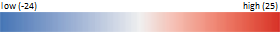
This map shows the areas of change from 1993 to 2009 in Human Footprint. Shades of blue indicate areas of decreasing human pressure, and shades of red indicate areas of increasing human pressure and development. Transparent areas, indicate little or no change in human pressure between 1993 and 2009.